PORTFOLIO
Clear (USAA)
-
Forward looking, highly personalized, and integrated conversational ideation.
-
The Clear initiative was a volunteer design effort to help our Financial Readiness team improve their experience. The current experience promptly asks the members to provide us with countless data points about all of their current finances, debts, legal documents and more, while visually promising this can be completed in 3 easy steps. Not to mention that each “simple step” takes about 4 to 5 screens to complete. The team was faced with finding a way to increase engagement with the tool, increase completion rates, and bring members back to the tool to re-evaluate their financial status over time.
-
I love having a chance to work on blue-sky ideas and since this aligns with the company mission to secure the financial security of our members, I promptly gathered a team. I knew this wasn’t an effort I could accomplish alone and that I’d need to bring in others who had different skills and expertise. The first person I asked to join was Michael Brown, a friend of mine who also happened to be a Digital Product Manager as well as a former Financial Advisor. This was a good start, but without a visual designer, we were dead in the water. I reached out to a few designers, but they had already started building their own teams. Luckily, a visual designer reached out to me just as I was about to approach him. Ian Smith, a talented designer with a vision for the future!
-
Together we reviewed the scope of the effort and held plenty of whiteboarding sessions to examine the current state as well as what the Financial Readiness team needed to accomplish. The business partners sponsoring the effort gave us a lot of information about what they’d like to see happen, but provided little to no supporting research, personas, or data to help us better understand the space. So, like any good designers we did our own discovery by reading market intelligence reports about people and their finances, how different generations feel about approaching banks or financial advisors about saving for the future, and of course asking Michael plenty of questions about his conversations with our membership.
-
We held many working lunches, whiteboard ideation sessions, downloaded other conversational and financial apps to explore how others are approaching the space and from this Ian even created his own bot to show how it could all work. As the team captain, I worked diligently to keep us on schedule, track agreed upon scope, and figure out who had what action item. Ian had a connection in the Financial Readiness department, so we met with them to gather the personas they had and learned more about who their target audiences were. We also leaned on our secondary research to marry these two data points to create our own personas and scenarios for the project.
-
As the content lead, I crafted detailed user journeys, scenarios for each persona, as well as each line of text or option presented on the mobile screens. The user journeys helped put us in the member’s shoes so we could understand what their day to day is like and really understanding that “Financial Readiness” isn’t top of mind for them, even though it’s top of mind for USAA.
-
We ended up solving for two different personas, including one who needs us to be the ones to reach out first and slowly build trust over time. The other is more financially stable who wants to have “the conversation” with us about ensuring they are on track to achieve their life goals.
-
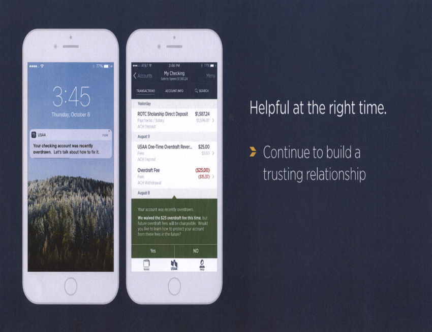
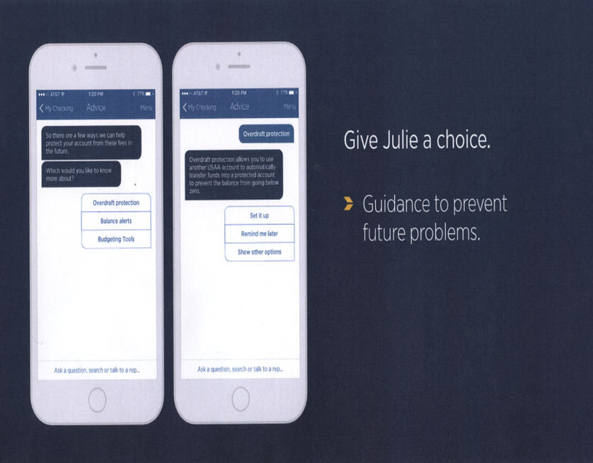
A few notable items we changed about the experience was to start by getting to know our member. We started by asking about what’s important to them and why, rather than just jumping into financials. We also crafted a proactive engagement model which members could opt into which provides timely tips and helpful information to set them up for success in the future one baby step at a time. Together, we envisioned the re-engagement models for both personas that reward them for micro-successes and help them feel positive about the smallest of wins. Lastly, we tied it all together with a unified, stitched in experience where the tips and tools present themselves at relevant touchpoints and crafted a unified look and feel for all digital assistance.
-
You can see the detailed personas, experience principles we focused on for the design in the full presentation below. We had the honor of presenting our concept to multiple executive leaders as well as the USAA Board of Directors, and received extremely positive feedback on our ideas to improve the experience. Although there was significant desire to take these ideas and get them implemented, it’s a huge task to build the level of detailed interaction design and create all of the models needed to build this correctly. Our work has inspired teams over the years and follow up research sessions have been conducted to find the steps we can take so how our company can deliver an experience like the ideas we crafted together. I love the support we received for our efforts and the fact that even though our idea is not implementable now, it is setting a high bar for where the company is trying to go.


